
Snapchat’s logo has a fascinating history filled with bold design choices and clever symbolism. Learning about Snapchat logo history can give you deeper insights into how the app has evolved and stayed relevant. Find out why the iconic, playful yellow ghost logo stands out in the crowded world of social media. Read on to learn the meaning behind the design and its significance.
| Year | Event | Logo Description |
|---|---|---|
| 2011 | Picaboo launches with the first ghost logo | A playful ghost icon named Ghostface Chillah |
| 2011 | Picaboo rebrands to Snapchat; new logo introduced | The iconic yellow ghost logo |
| 2013 | Minor redesign for a cleaner look | Streamlined ghost with subtle changes |
| 2019 | Major logo redesign with a bold black outline | Ghost with a bold, black outline |
See Also: Step-by-Step Guide on How To Download Snapchat Stories
Contents
Snapchat Logo History
The app was initially called Picaboo and launched with a playful ghost logo named Ghostface Chillah, which symbolized the app’s core feature of disappearing messages. Still, when the app rebranded to Snapchat later in 2011, the logo was redesigned. The new logo retained the ghost but gave it a distinct yellow background. This bright, attention-grabbing color helped Snapchat stand out among other social media apps.
![]()
In 2013, Snapchat made a minor update to its logo, simplifying the ghost to give it a cleaner look. This subtle change was aimed at making the logo more modern and visually appealing because the simplicity of the ghost logo aligns with Snapchat’s user-friendly and fun experience.
In 2019, Snapchat’s logo underwent a significant redesign, and Yellow Ghost was given a bold, black outline to make it more prominent. This redesign enhanced the logo’s visibility and brand recognition. The yellow ghost logo has become iconic, representing Snapchat’s unique approach to mobile messaging and augmented reality lenses.
The Ghostface Chillah logo represents Snapchat’s playful spirit and focuses on user privacy. The ghost symbolizes messages that appear and disappear, much like ghosts. This feature has been a critical element of Snapchat’s success, making it a favorite among users who value privacy.
Evan Spiegel, Snapchat’s co-founder, emphasized simplicity in the logo design because he wanted a logo that was easy to recognize and memorable. With its bright yellow background, the ghost logo perfectly achieves this goal.
Snapchat’s logo evolution reflects the app’s growth and adaptation to changing user needs. From its early days as Picaboo to its current status as a leading social media platform, the yellow ghost remains a powerful symbol of Snapchat’s identity.
You can go through the Snapchat Ghost logo usage guidelines to learn more.
Snapchat Logo History Timeline
Snapchat’s logo has changed several times since its inception in 2011, but if you are not on Snapchat, check out these socializing apps like Snapchat, which will give you a similar experience. Here are some major changes that were made throughout several time periods.
Picaboo Launches: 2011
The app initially launched as Picaboo, where the Snapchat logo history starts. Its logo featured a playful ghost named Ghostface Chillah, symbolizing the app’s core feature: disappearing messages. 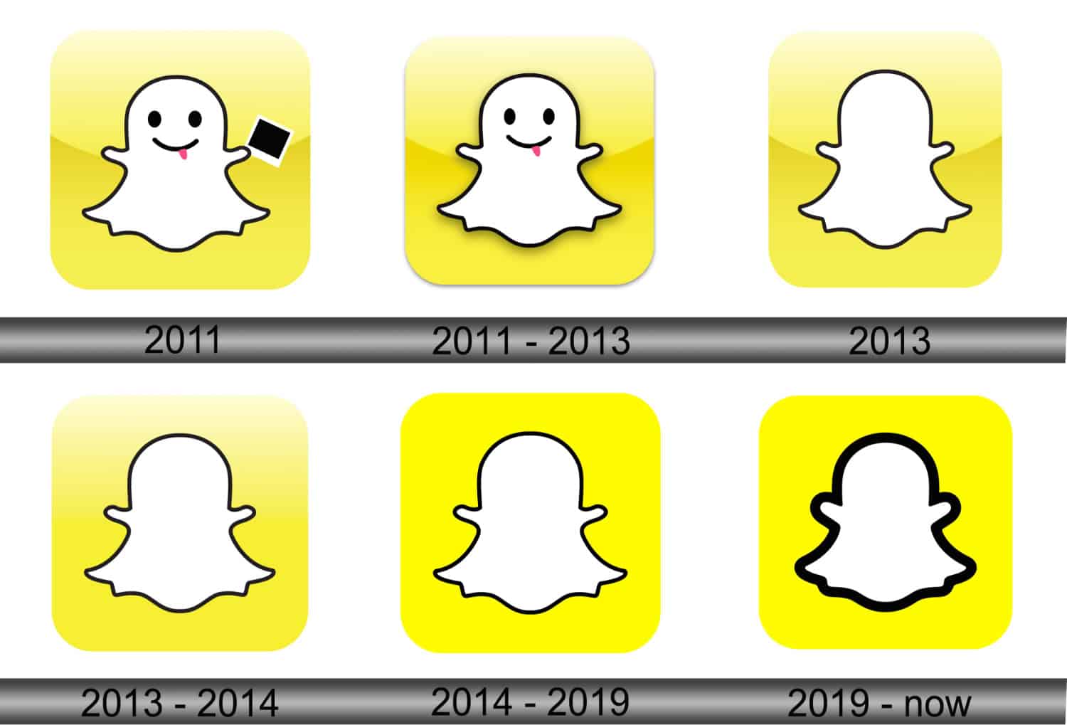
Rebranding to Snapchat: 2011
Later, in 2011, Picaboo rebranded to Snapchat, and the redesigned logo with a yellow background made the ghost logo more distinctive and recognizable.
Minor Redesign: 2013
In 2013, Snapchat updated its logo with subtle changes where the ghost was streamlined for a cleaner and more modern look. This update aimed to enhance visual appeal and brand identity.
Major Redesign: 2019
The most significant change in Snapchat’s logo history came in 2019 when the ghost was outlined with a bold, black border. This major redesign improved visibility and strengthened brand recognition, making the yellow ghost logo even more iconic. This change also came with an update on how to find local people on Snapchat to expand social circles.
Snapchat has maintained the ghost as its central logo element throughout these changes. This consistency reflects the company’s commitment to its playful and user-friendly image in which the ghost represents Snapchat’s focus on privacy and fun, driving its popularity.
Each logo redesign has aimed to improve brand recognition while keeping Snapchat’s essence intact because the yellow ghost remains a powerful symbol of Snapchat’s identity and evolution.
What is the Meaning Behind the Snapchat Logo?
The Snapchat logo features a ghost named Ghostface Chillah, symbolizing the app’s primary feature: disappearing messages as the messages appear briefly and then vanish like ghosts, aligning perfectly with Snapchat’s unique messaging service.
![]()
Throughout the Snapchat logo’s history, the design of the ghost logo has been simple yet memorable. Evan Spiegel, Snapchat’s co-founder, wanted a logo that stood out in the crowded social media space. The ghost, with its friendly and fun appearance, achieves this goal. It represents the app’s mission to make communication light-hearted and enjoyable.
The logo’s bright yellow background enhances its visibility and adds to its playful vibe because yellow is associated with happiness and energy and aligns with Snapchat’s brand identity. By choosing Pantone Yellow U, Snapchat created a distinctive and energetic logo.
The ghost logo encapsulates Snapchat’s essence because it highlights the app’s focus on user privacy and fun. With privacy becoming more crucial, you may try to learn how to decrease your Snapchat score; check this out for more valuable insights. The logo’s simplicity makes it easily recognizable, helping Snapchat maintain a strong brand presence. The ghost’s friendly appearance and the concept of disappearing messages make the Snapchat logo both meaningful and iconic.
Why is the Snapchat Logo Yellow?
The Snapchat logo is yellow to create a distinctive and energetic brand identity. Yellow is a vibrant and attention-grabbing color, making Snapchat stand out among other social media platforms. This color choice enhances the logo’s visibility, ensuring the ghost icon is easily recognizable, even at a glance, and marks a significant success in Snapchat logo history.
![]()
Evan Spiegel, Snapchat’s co-founder, selected yellow because it conveys happiness and positivity. These qualities align with Snapchat’s mission of making communication fun and engaging, as the bright yellow background helps communicate the app’s playful and friendly nature.
Additionally, yellow is relatively uncommon among prominent social media logos, and this uniqueness helped Snapchat differentiate itself in a crowded market. Using Pantone Yellow U, Snapchat established a strong visual identity that attracts and retains users.
The yellow background also serves a practical purpose, making the white ghost icon, Ghostface Chillah, stand out more clearly. This high contrast ensures the logo is effective across various digital and print mediums.
In summary, the Snapchat logo’s yellow color is a strategic choice because it enhances brand recognition, conveys a cheerful, playful image, and helps the ghost icon stand out, reinforcing Snapchat’s unique position in the market.
See Also: How Often Do Snap Scores Update on Snapchat?
FAQs
What was the Snapchat logo in 2011?
In 2011, the Snapchat logo featured a playful ghost named Ghostface Chillah. This ghost icon was used when the app was initially called Picaboo.
What is the secret logo of Snapchat?
Snapchat's secret logo is the ghost icon known as Ghostface Chillah. It represents the app's unique feature of disappearing messages.
What is the ghost logo?
The ghost logo is Snapchat's iconic symbol, representing disappearing messages and user privacy. It’s a playful, friendly ghost known as Ghostface Chillah.

Introducing TechiePlus’s all-in-one Editor, Olivia, based in London. From headphones to music streaming, she’s got you covered.